Flexbox based grid system
Since version 21.12.26 VisualNEO Web includes a complete Flexbox based responsive grid system.
This grid system is based on 12 columns, just as the original BootStrap one and three sizes: sm (small < 768px), md (medium) and lg (large >= 960px)
Be sure to configure each column for each possible size.
Here's a detailed explanation of how to work with this grid system:
1. Grid Structure
- The grid system in VisualNEO Web is based on 12 columns, similar to Bootstrap's grid layout. This column structure allows you to divide a row into up to 12 units, making it easy to create layouts with varying widths across different devices.
- It includes predefined sizes based on breakpoints for responsive design:
- sm: For small devices, typically screens smaller than 768px.
- md: For medium devices, generally screens between 768px and 960px.
- lg: For large devices, screens that are 960px or larger.
2. CSS Classes
VisualNEO Web provides specific CSS classes for applying the Flexbox grid. Here are some commonly used classes:
- neo-row: Defines a row in the grid layout.
- neo-col-[n]: Specifies the number of columns an element should span (replace [n] with values from 1 to 12).
- neo-col-sm-[n], neo-col-md-[n], neo-col-lg-[n]: Apply column spans based on device size, adjusting layout for small, medium, or large devices respectively.
3. Creating Rows and Columns
- Begin by defining rows with neo-row, and then add columns within that row using neo-col-[size] classes.
- You can nest rows and columns, where each nested structure begins with neo-row and requires columns inside it.
4. Responsive Adjustments
- You can control the visibility of columns at different breakpoints using classes like neo-hide-sm, neo-hide-md, and neo-hide-lg.
- Classes such as neo-row-space-between, neo-row-space-around, and alignment classes (neo-row-left, neo-row-center, neo-row-right) help adjust spacing and alignment, ensuring that the layout remains visually balanced across devices.
5. Aligning Content within Columns
- For vertical alignment within columns, you can use classes like neo-row-top, neo-row-middle, or neo-row-bottom to align content within each column in a row.
This grid system provides a flexible foundation for responsive designs in VisualNEO Web, making it easier to manage layouts that adapt to various device sizes.
These CSS clasess are available in order to use it while designing your own responsive apps:
Fluid Grid

neo-row
neo-col-12
neo-row
neo-col-1
neo-col-11
neo-row
neo-col-2
neo-col-10
neo-row
neo-col-3
neo-col-9
neo-row
neo-col-4
neo-col-8
neo-row
neo-col-6
neo-col-6
Responsive Grid

neo-row
neo-col-sm-12
neo-row
neo-col-sm-12 neo-col-md-3 neo-col-lg-3
neo-col-sm-12 neo-col-md-9 neo-col-lg-9
neo-row
neo-col-sm-12 neo-col-md-4 neo-col-lg-4
neo-col-sm-12 neo-col-md-8 neo-col-lg-8
neo-row
neo-col-sm-12 neo-col-md-6 neo-col-lg-6
neo-col-sm-12 neo-col-md-6 neo-col-lg-6
Smart Columns

neo-row
neo-col-sm-12 neo-col-md-6 neo-col-lg-4
neo-col
Reverse order
Extend a row with the row-reverse class to reverse the order of the columns. For responsive use neo-row-sm-reverse, neo-row-md-reverse or neo-row-lg-reverse.

neo-row neo-row-reverse
neo-col-4
neo-col-4
neo-col-4
Align left
Extend a row with the neo-row-left class to align the columns to the left. For responsive use neo-row-sm-left, neo-row-md-left or neo-row-lg-left.

neo-row neo-row-left
neo-col-2
neo-col-3
neo-col-2
Align right
Extend a row with the neo-row-right class to align the columns to the right. For responsive use neo-row-sm-right, neo-row-md-right or neo-row-lg-right.

neo-row neo-row-right
neo-col-2
neo-col-3
neo-col-2
Align center
Extend a row with the neo-row-center class to align the columns to the center. For responsive use neo-row-sm-center, neo-row-md-center or neo-row-lg-center.

neo-row neo-row-center
neo-col-2
neo-col-3
neo-col-2
Space between
Extend a row with the neo-row-space-between class to distribute the columns evenly in the line. The first column will be aligned to the left and the last column to the right. For responsive use neo-row-sm-space-between, neo-row-md-space-between or neo-row-lg-space-between.

neo-row neo-row-space-between
neo-col-2
neo-col-3
neo-col-2
Space around
Extend a row with the neo-row-space-around class to distribute the columns evenly in the line. The columns will have equal space between them. The space at the begin and the end of the line will be half of the space between the columns. For responsive use neo-row-sm-space-between, neo-row-md-space-between or neo-row-lg-space-between.

neo-row neo-row-space-around
neo-col-2
neo-col-3
neo-col-2
Individual height align top
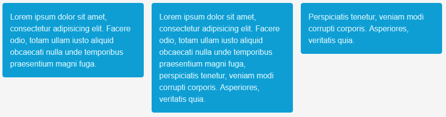
neo-row neo-row-top
neo-col-4
neo-col-4
neo-col-4
Individual height align center

neo-row neo-row-middle
neo-col-4
neo-col-4
neo-col-4
Individual height align bottom

neo-row neo-row-bottom
neo-col-4
neo-col-4
neo-col-4
Individual height align lingle column

neo-row neo-row-top
neo-col-3 neo-col-bottom
neo-col-3
neo-col-3 neo-col-top
neo-col-3 neo-col-middle
Equal column height

neo-row neo-row-equal
neo-col-4
neo-col-4
neo-col-4
Hide column for current breakpoint

neo-row
neo-col-4 neo-hide-sm
neo-col-4 neo-hide-md
neo-col-4 neo-hide-lg
Nested grids
The Flex Grid is nestable. Every nested grid needs the neo-grid container.

neo-row neo-row-equal
neo-col-6
neo-grid
neo-row neo-row-equal
neo-col-6
neo-col-6
neo-row neo-row-equal
neo-col-3
neo-col-9
neo-col-6
neo-grid
neo-row
neo-col-4
neo-col-8
neo-row
neo-col-7
neo-col-5
Created with the Personal Edition of HelpNDoc: Maximize Your Productivity with a Help Authoring Tool